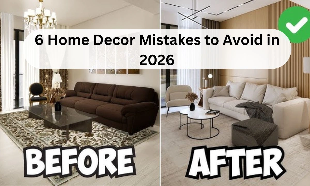
Outdated vs Modern: 6 Home Decor Mistakes to Avoid in 2026: Trends move fast, but by 2026, the gap between a lived-in home and an outdated one will have become cavernous. After ten years of watching design cycles, I’ve seen homeowners cling to styles that were revolutionary in 2015 but now make a space feel heavy and tired. Modern design in 2026 isn’t about being futuristic; it’s about authenticity and soft geometry. If your home feels off despite being clean, you’re likely falling for one of these six common traps.
Here is information on Outdated vs. Modern:
1. Ditch the All-Grey Everything
The Millennial Grey era is officially over. For years, people painted walls, floors, and sofas in various shades of cool grey to look modern. In 2026, this looks clinical and dated.
The Fix: Switch to Warm Neutrals. Think oatmeal, mushroom, or soft terracotta. These tones bring life back into the room and make your lighting look more expensive.
2. Stop Using Fast Furniture Sets
Buying a matching bedroom or living room set (where the sofa, loveseat, and chair all match) is the quickest way to make a home look like a budget showroom.
The Fix: Aim for a Curated look. Mix a leather chair with a fabric sofa. Use mismatched nightstands that share a similar height. The goal is to make the room look like it evolved, not like it was delivered in one box.
3. Say Goodbye to Word Art
Signs that say Live, Laugh, Love, or Kitchen have no place in a 2026 interior. They create visual clutter and feel juvenile.
The Fix: Replace text-based decor with Abstract Textures. Use a framed piece of textured textile, a sculptural ceramic, or a high-quality landscape photograph. Let the mood of the room speak, not the literal words on the wall.
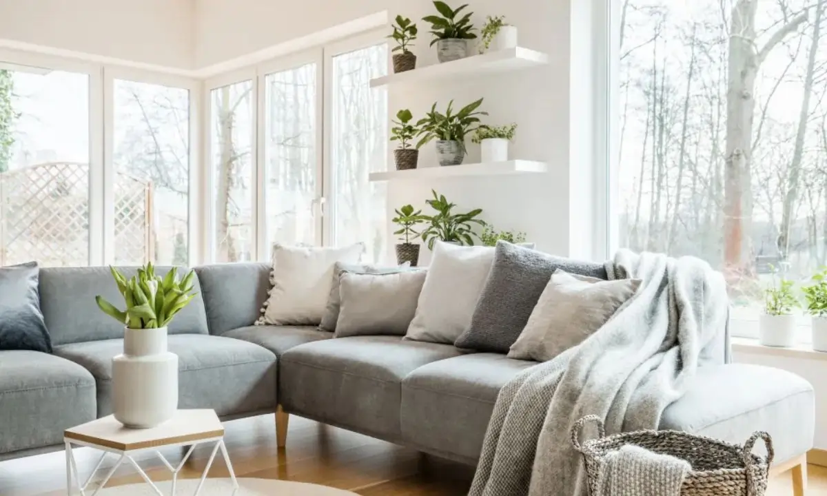
4. The End of Boho Macramé Overload
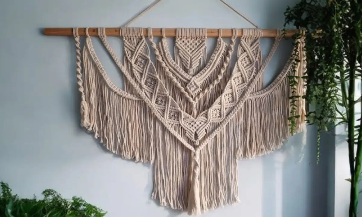
While natural textures are still in, the 2020 obsession with hanging macramé and shabby chic distressed wood has peaked. Too much of this makes a room look dusty.
The Fix: Move toward Organic Modernism. Keep the natural materials like jute or linen, but use them in clean, sharp lines. Swap the fringe for smooth wood finishes and woven leathers.
5. Over-Styled Shelfies
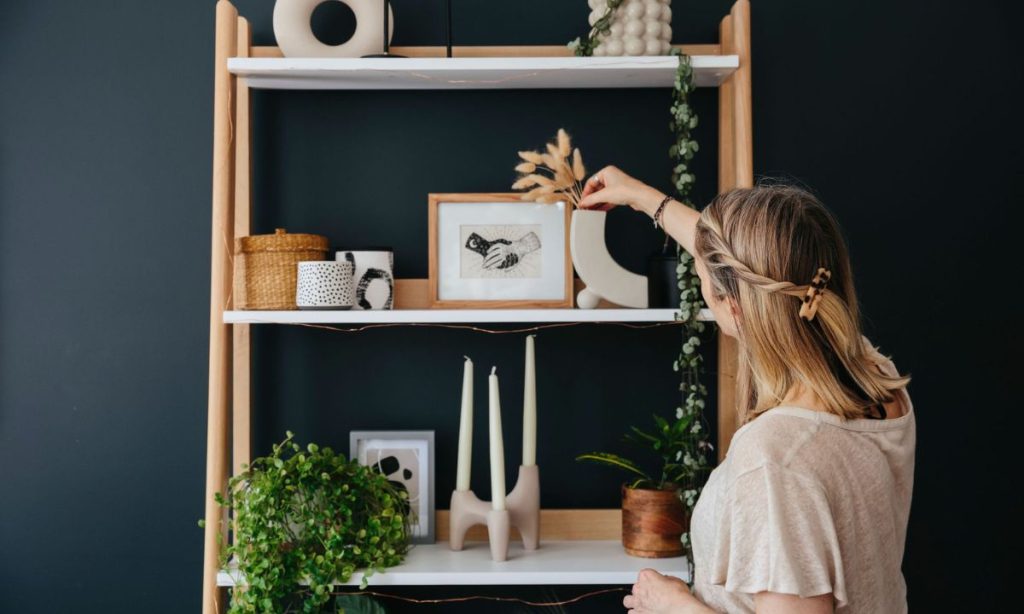
We used to pack bookshelves with color-coded books and dozens of tiny trinkets. In 2026, this maximalist shelf look feels suffocating.
The Fix: Practice Negative Space. Remove 30% of what is on your shelves. Group three items of different heights, then leave a gap. This breathing room allows the eye to actually appreciate the items you’ve kept.
6. Harsh Overhead Boob Lights
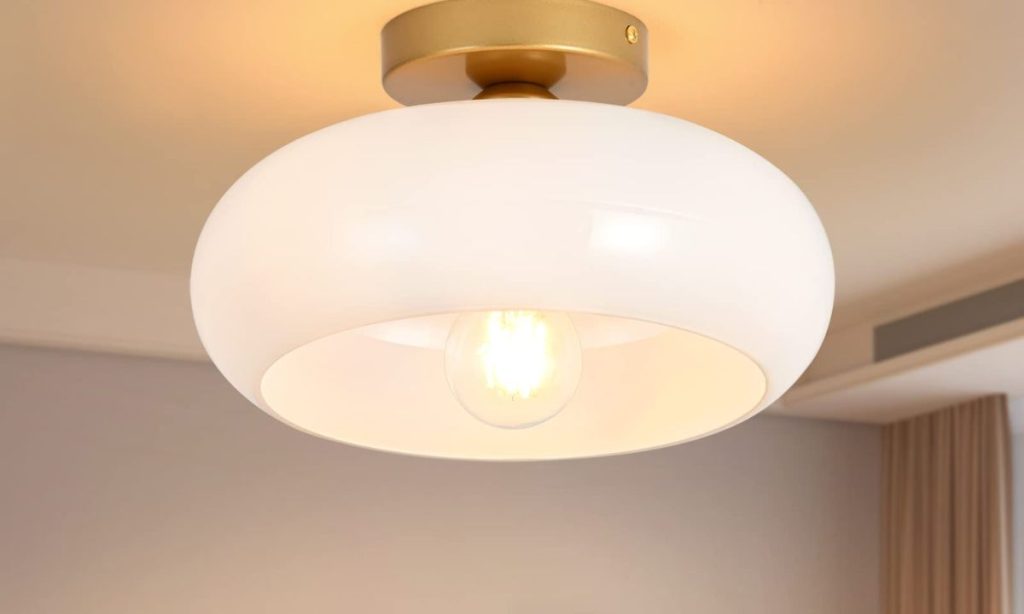
Those flush-mount dome lights in the center of the ceiling are the ultimate design killer. They cast flat, unflattering shadows and highlight every floor imperfection.
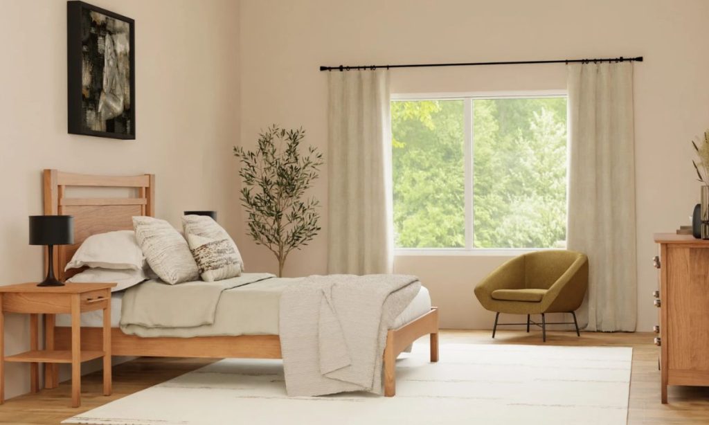
The Fix: Layered Ambient Lighting. Based on 2026 staging data, homes with at least three light sources per room (table lamp, floor lamp, and wall sconce) sell faster and feel more premium. Turn off the big ceiling light and use lower light sources.
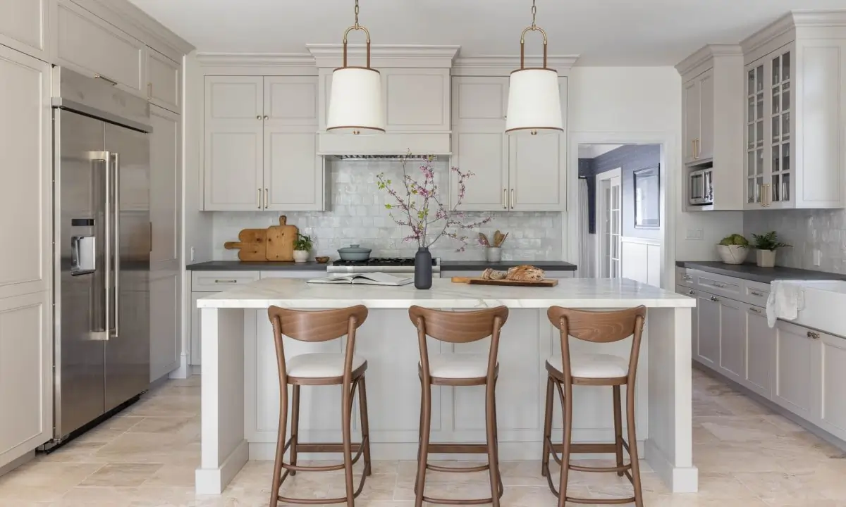
The Hardware Mix
Official data suggests that matching your metals—making every handle, tap, and lamp the same chrome or gold—is a mistake. In 2026, the most sophisticated homes mix two metals. Try matte black for your door handles and aged brass for your lamps. This mixed metal approach makes the hardware look like custom jewelry for your home.
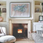
Common Mistake: Small-Scale Art
The most frequent error I see is a tiny picture frame hanging on a massive wall. It makes the wall look like it’s eating the art. If you have a large wall, you need large art. If you only have small pieces, group them into a tight “gallery wall” so they act as one large visual unit.

Mukesh Kumar is a dedicated news editor and content strategist known for delivering accurate, clear, and impactful stories. With strong expertise in home décor, business, technology, and trending topics, he focuses on creating well-researched, reader-friendly content that informs and engages audiences. Backed by over four years of experience in content writing, Mukesh currently contributes his skills and editorial insight to bamaclick.com, ensuring every article meets high standards of quality and reliability.